12 Branding Style Guide Examples For Your Inspiration
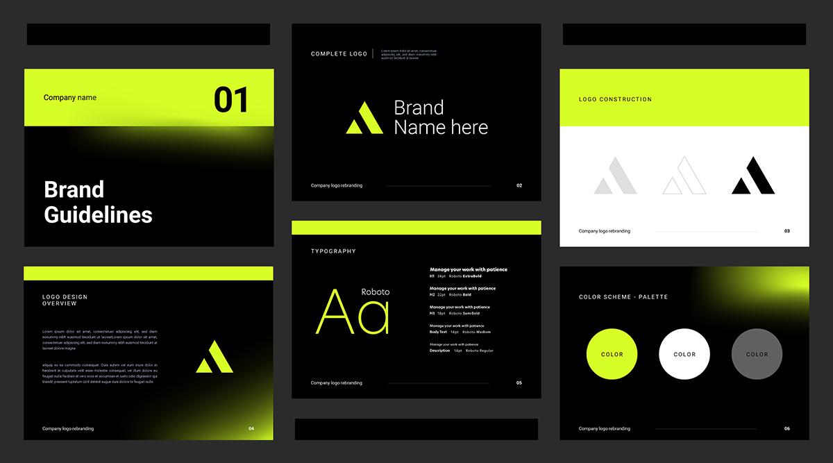
Great brands grab your attention with a message that's easy to get and a style that's hard to forget. If you want to make a brand that really sticks in people's minds, you've got to have a strong message and a consistent look. That's where a brand guideline comes in; it's basically your go-to manual for keeping everything in line.
Why Are Brand Guidelines So Important?
In simple terms, the Branding Style Guide or Brand Guidelines serve as a comprehensive guide for using all branding elements consistently across the globe. But their role goes beyond just providing clear instructions. These standards are crucial for:
- Upholding the brand's authenticity and building its value;
- Maximizing the reach of our operations in all markets;
- Ensuring consistent, high-quality branding; and
- Boosting overall productivity within the system.
So what does a good one actually look like? Let's check out some really solid brand guides to get a feel for what makes them so effective.
Best Branding Style Guide Examples
We'll explore how these guides showcase the brand's overall design approach, giving us a comprehensive look at what makes them tick—and stick in people's minds.
TikTok
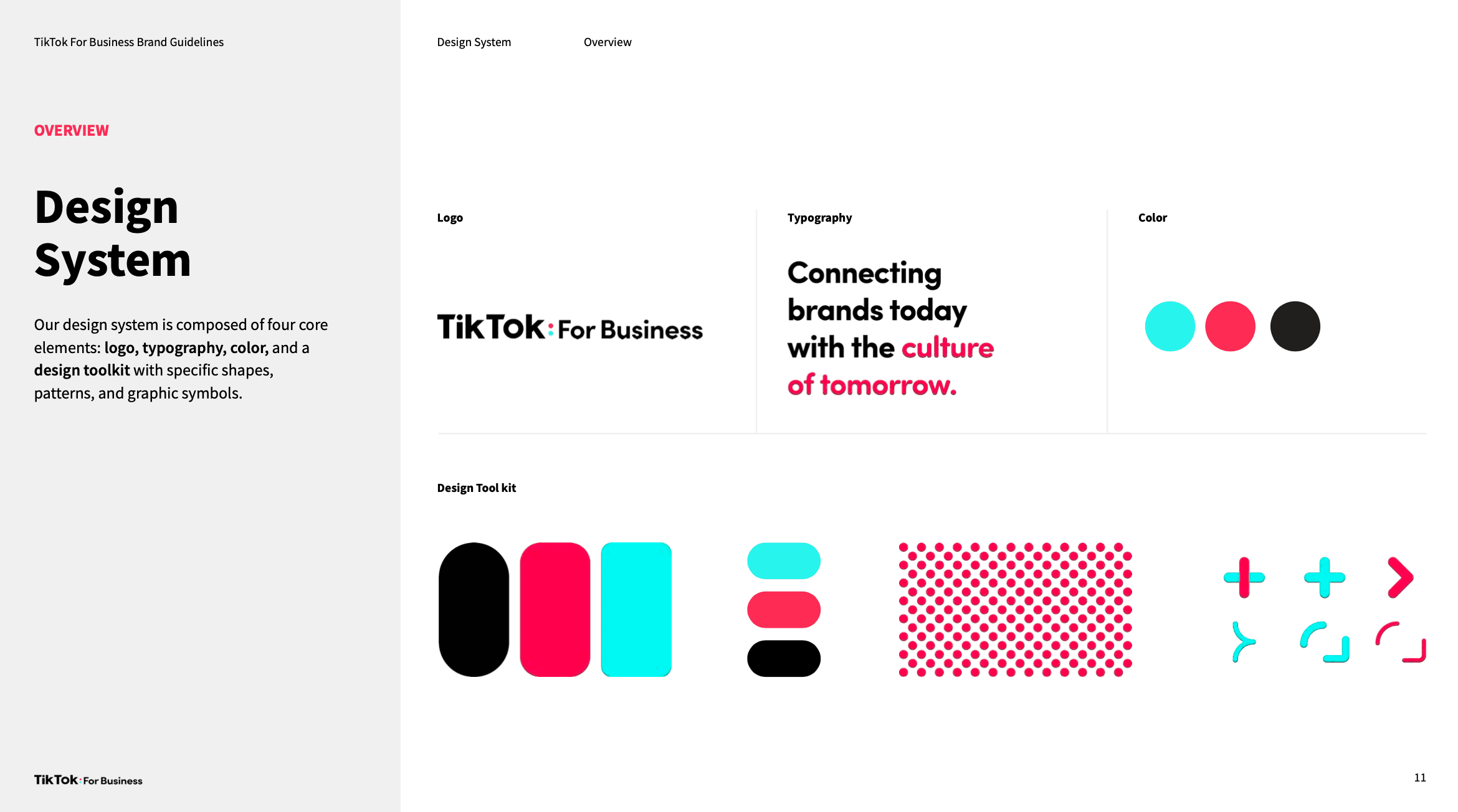
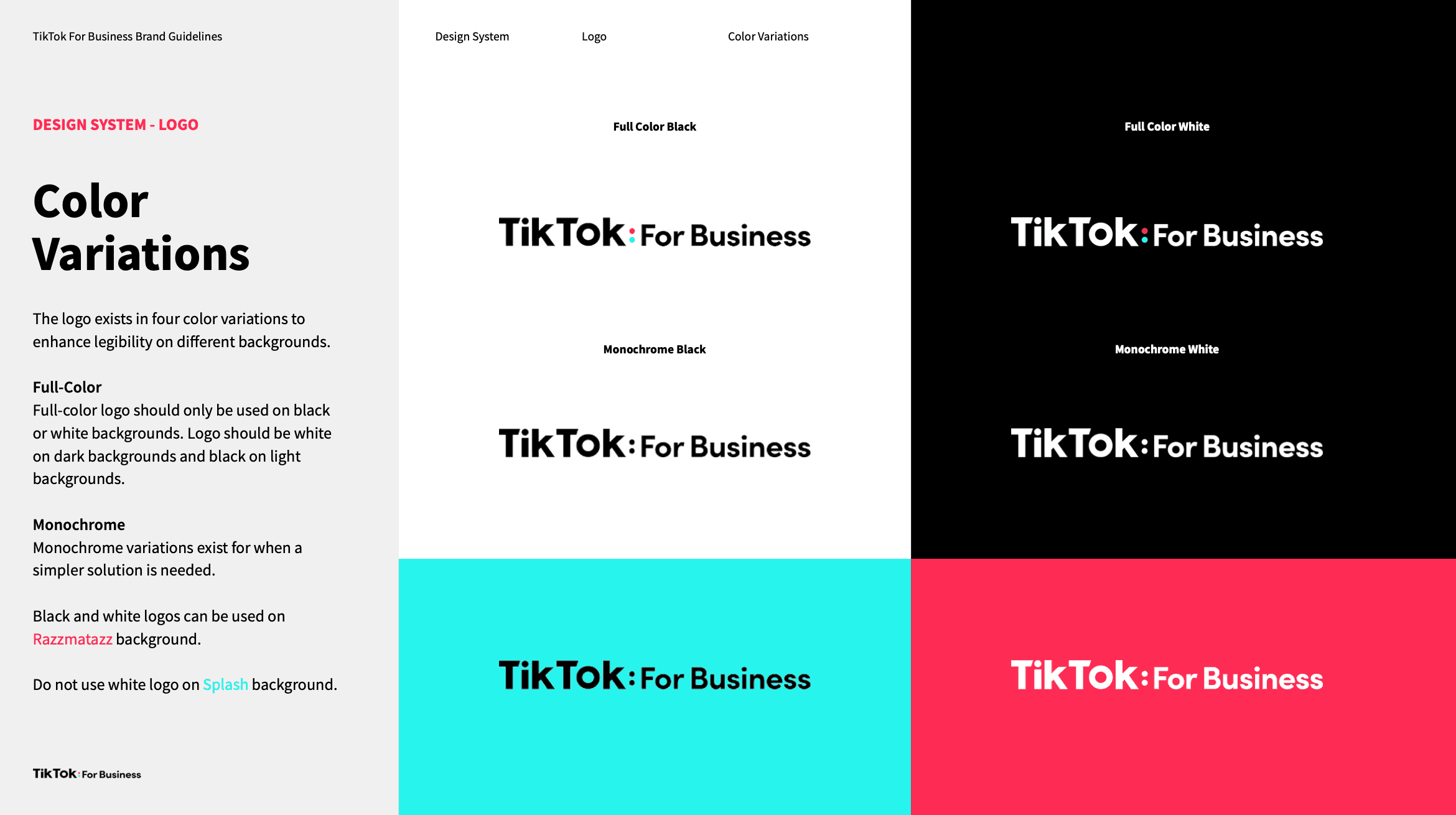
TikTok's got a brand guide that spells out what their logo, fonts, and colors should look like, as well as the general feel of the app. This stuff matters because it helps TikTok stick in people's minds and grow. If you're using TikTok, it's good to know these rules to help keep the platform fun and safe for everyone.
Check out the full brand guideline by clicking here.
Spotify
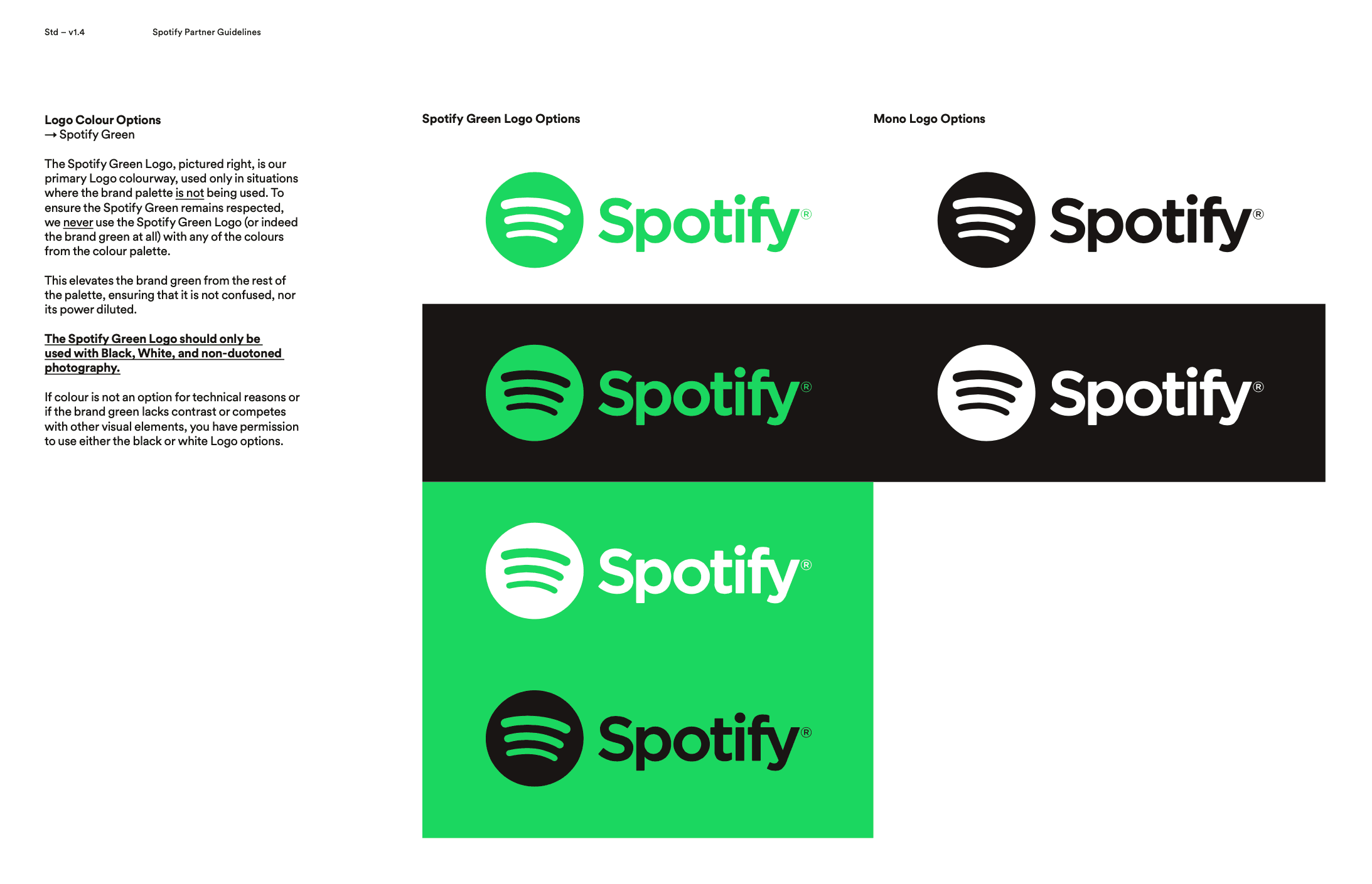
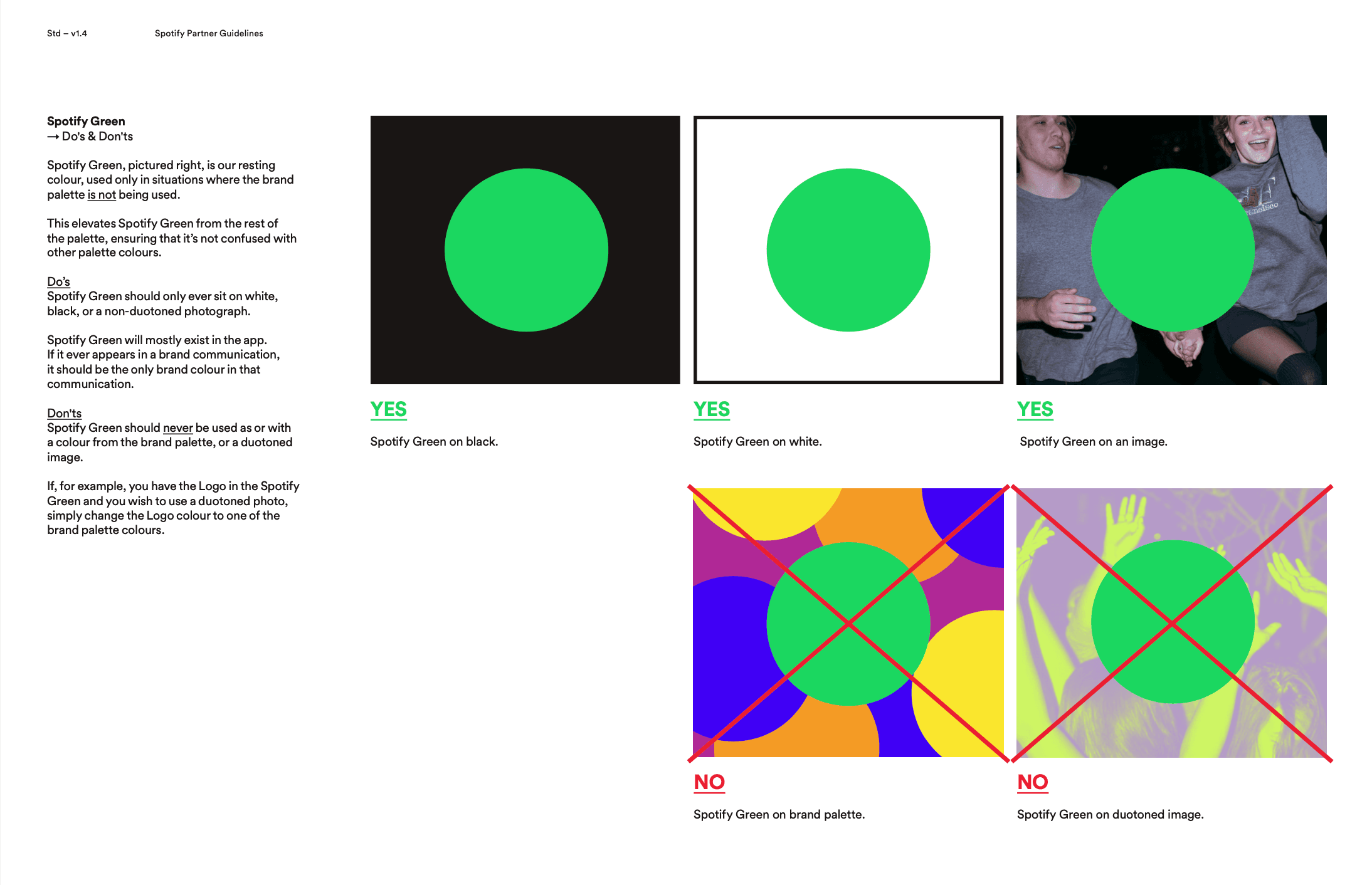
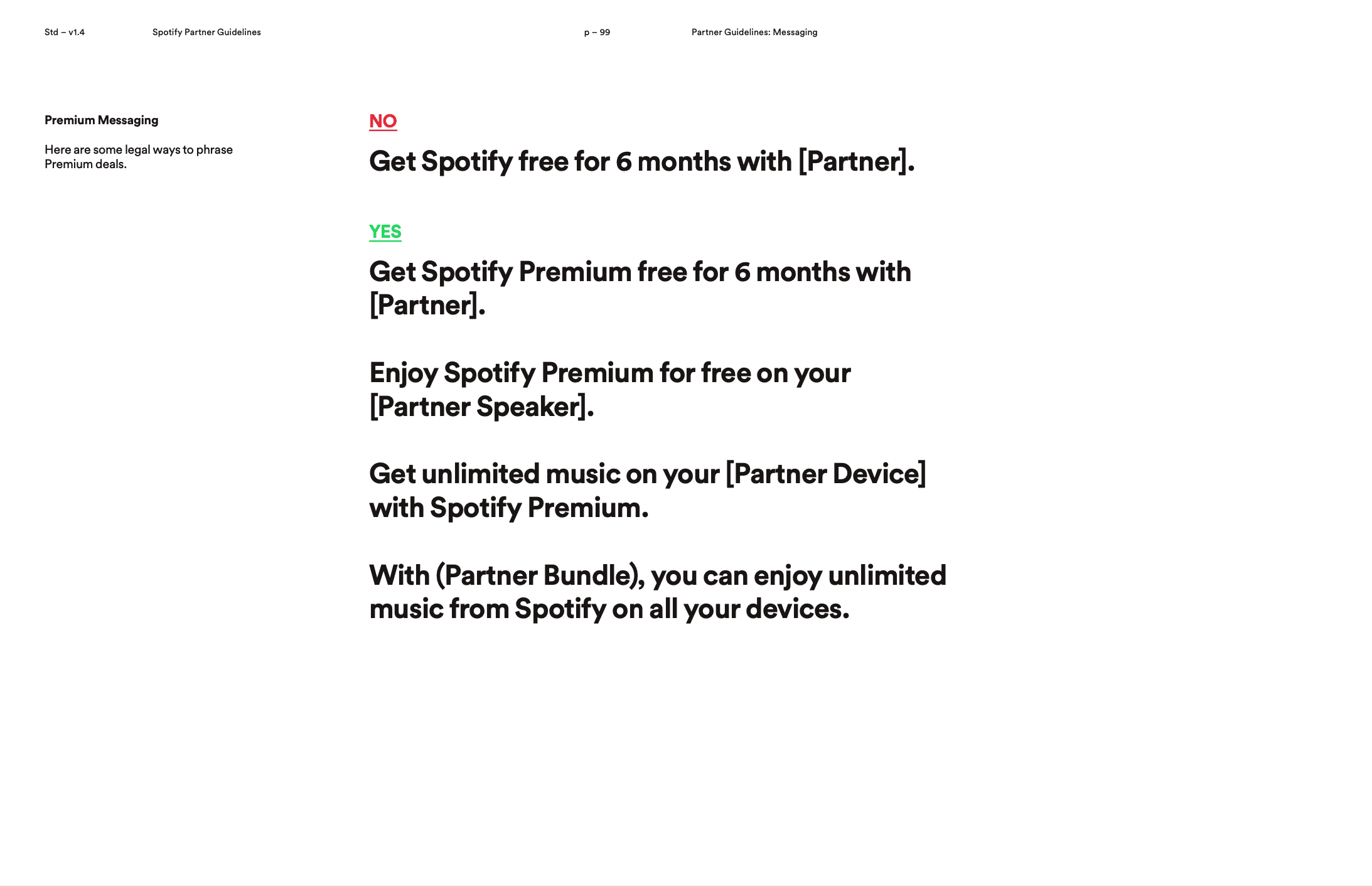
Spotify's visual provided a vibrant, engaging experience that mirrors the evolving musical tastes of its users. The bold shift towards duotone colors and contemporary design elements resonated particularly well with millennials, who appreciate visually stimulating and experiential design.
But Spotify didn't merely make small adjustments to their existing aesthetics; they took a significant, disruptive leap. This daring move allowed them to differentiate themselves in an overcrowded streaming landscape. The end result transformed Spotify from just another music service into a lifestyle brand that genuinely aligns with the emotional impact of music.
Check out the full brand guideline by clicking here.
Coca-Cola
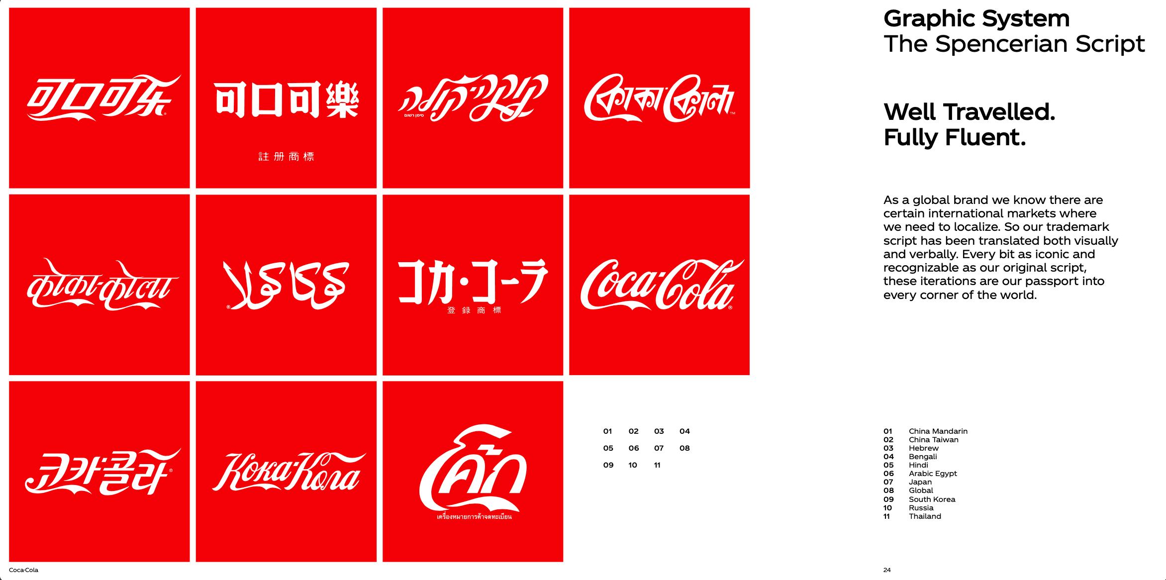
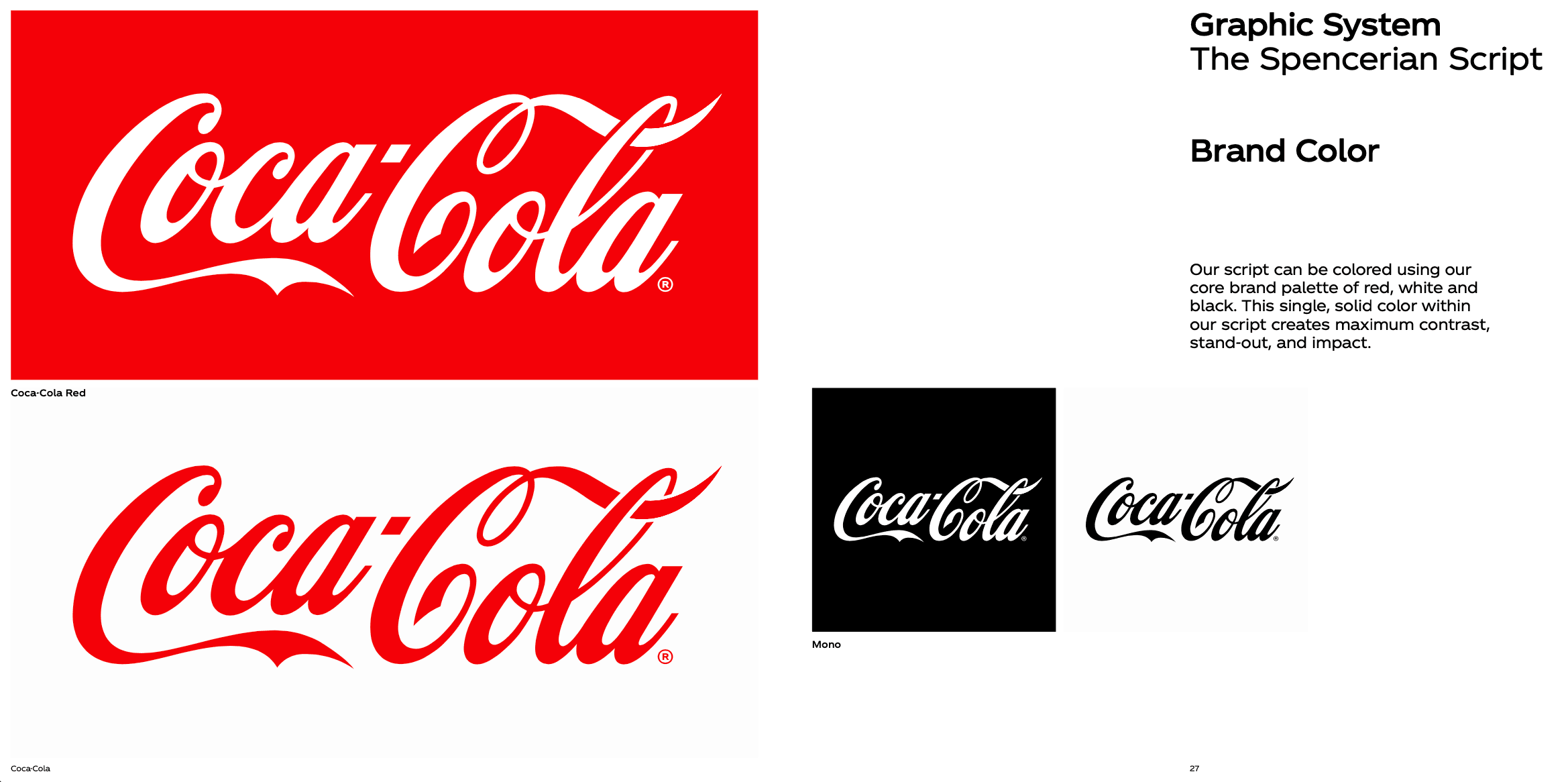
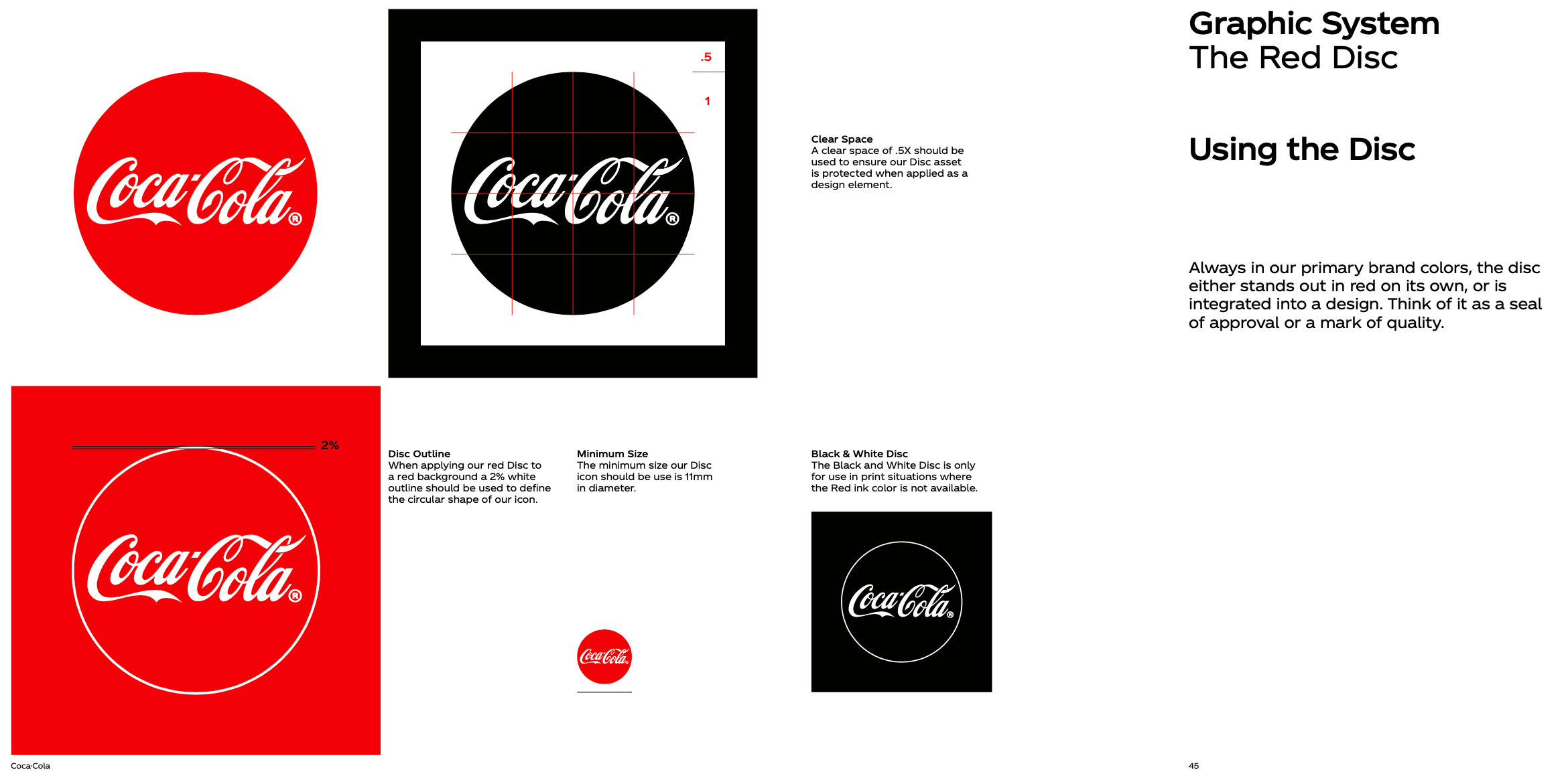
The Coca-Cola logo, a classic example of timeless design, has used a red and white color scheme since its inception to symbolize passion, youth, energy, love, purity, and class. Executed in Spencerian script—a font that flourished in the U.S. from 1850 to 1925—the logo encapsulates the unique flair the company's founder aimed for. This logo remains relevant even today, proving that simplicity and alignment with a brand's core values can create an enduring visual identity. Rather than chasing design fads, the focus has always been on the brand's mission, vision, and values, making it an ageless symbol that still effectively communicates the Coca-Cola story.
Check out the full brand guideline by clicking here.
Discord
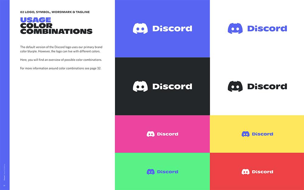
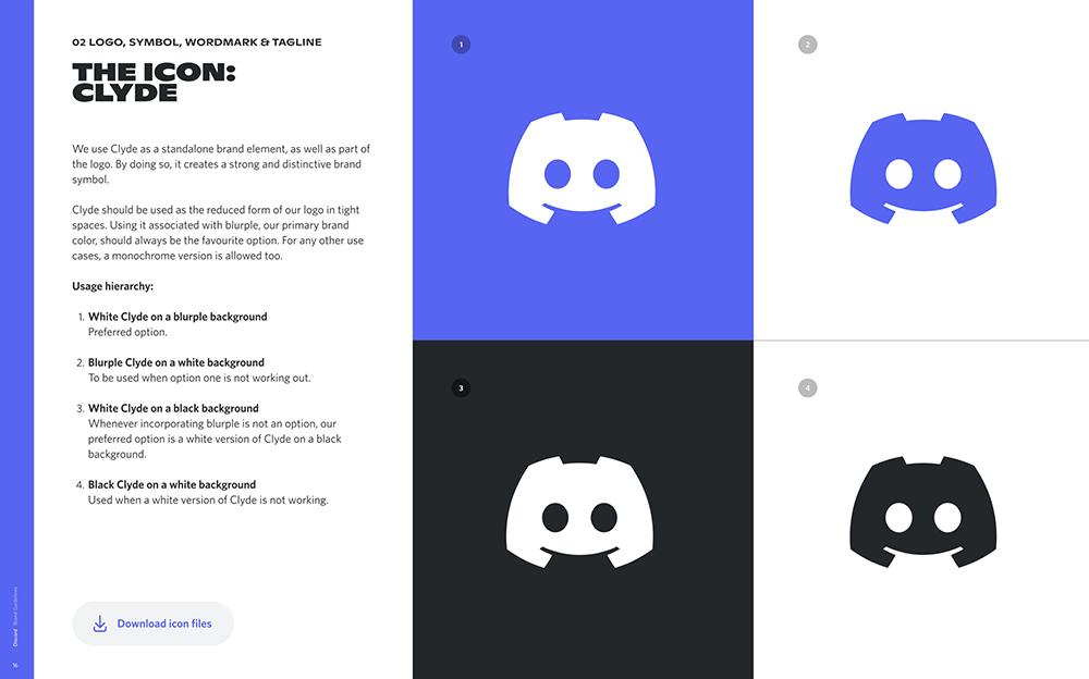
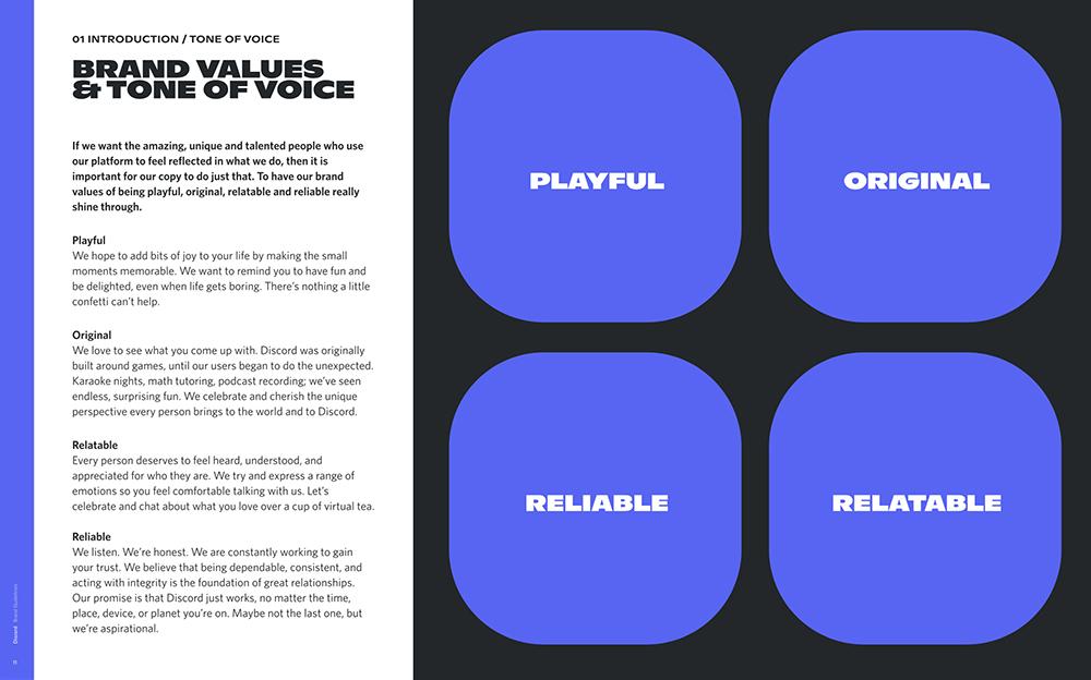
Discord likes to keep things chill and fun, saying it's not the kind of brand that takes itself too seriously. As more people are getting into Discord, not just gamers, it's gonna be interesting to see if the logo and vibe keep doing the trick. People like to call discord's logo"Clyde." At first, it looks a bit like a crab, but if you look closer, you see it's shaped like a game controller.
Discord's never said what Clyde is supposed to mean, so fans have come up with all sorts of guesses. The font they use is unique and fits right in with Clyde's fun personality. As for colors, Discord uses this cool mix of blue and purple they call "Blurple," along with white. On their own, these colors might seem calm or even formal, but when they're on Clyde, they're all about fun and good vibes. All in all, Discord's branding is really a piece of art!
Check out the full brand guideline by clicking here.
Starbucks
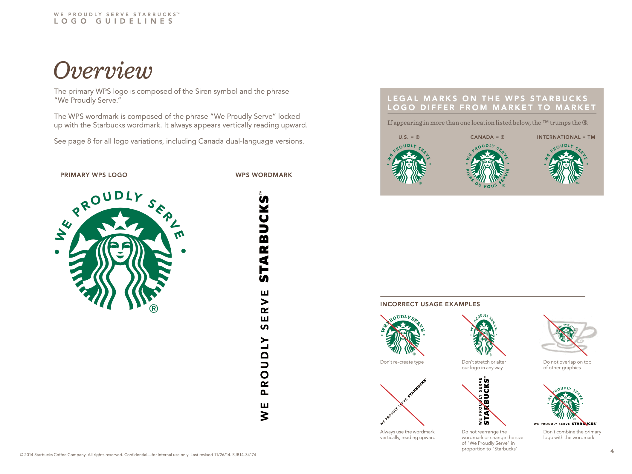
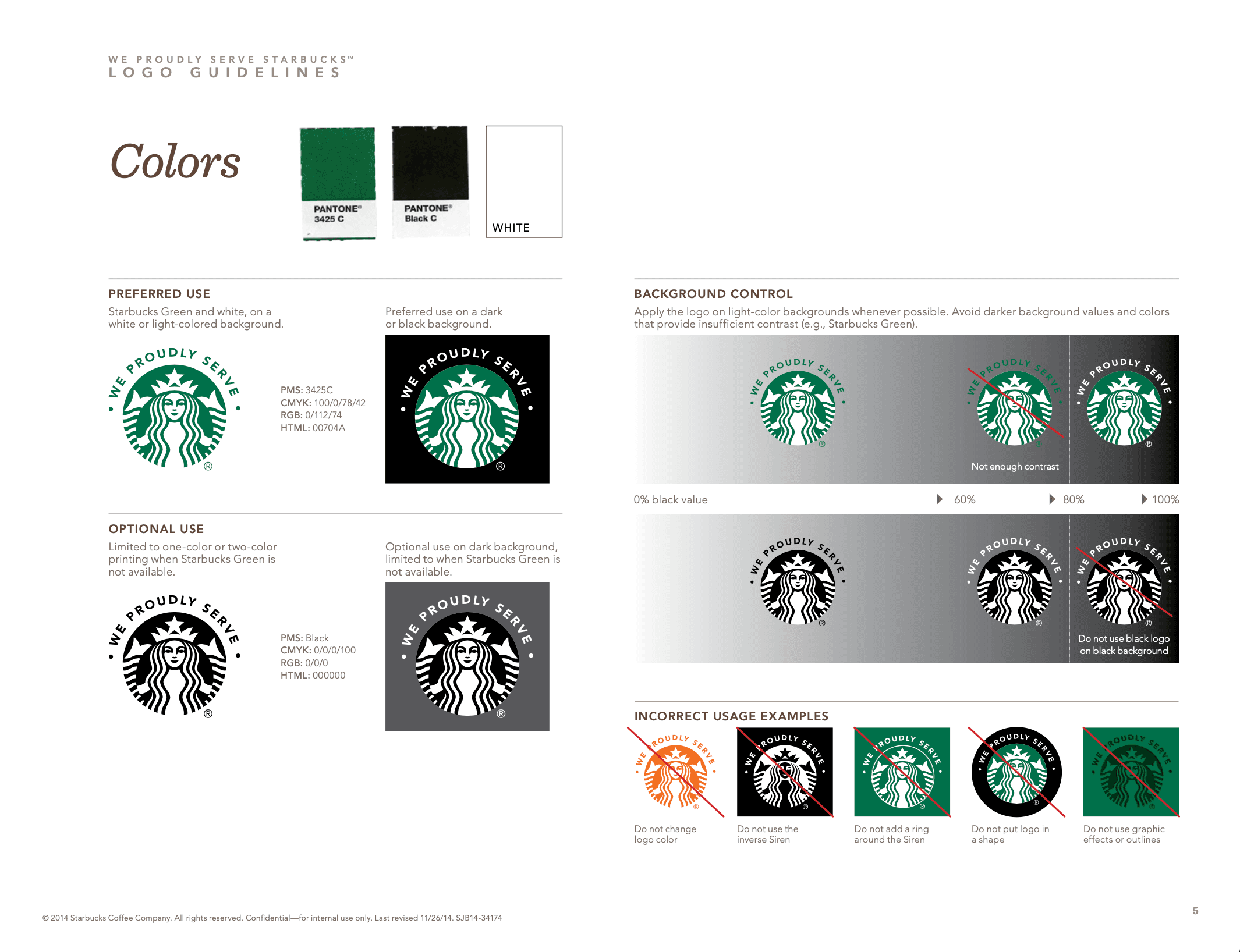
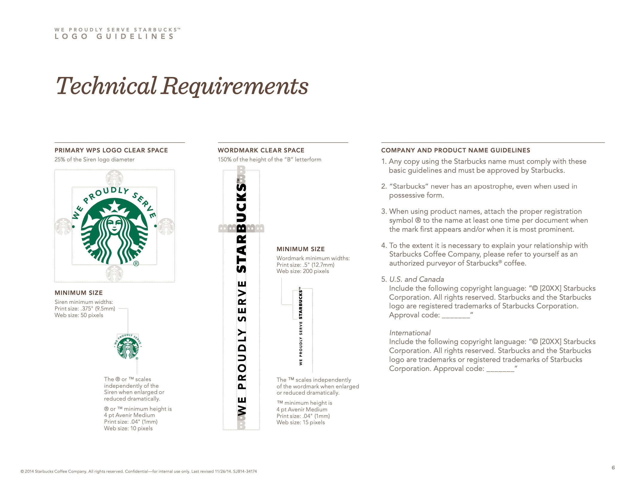
The Starbucks Creative Expression guide serves as a comprehensive overview of how the Starbucks brand takes form. From a palette focused on a family of greens to logos featuring the Siren as the brand's muse and face, each element is carefully curated. The guide also covers typography rules and emphasizes the use of expressive copy to let the brand's unique personality shine through.
Check out the full brand guideline by clicking here.
OpenAI
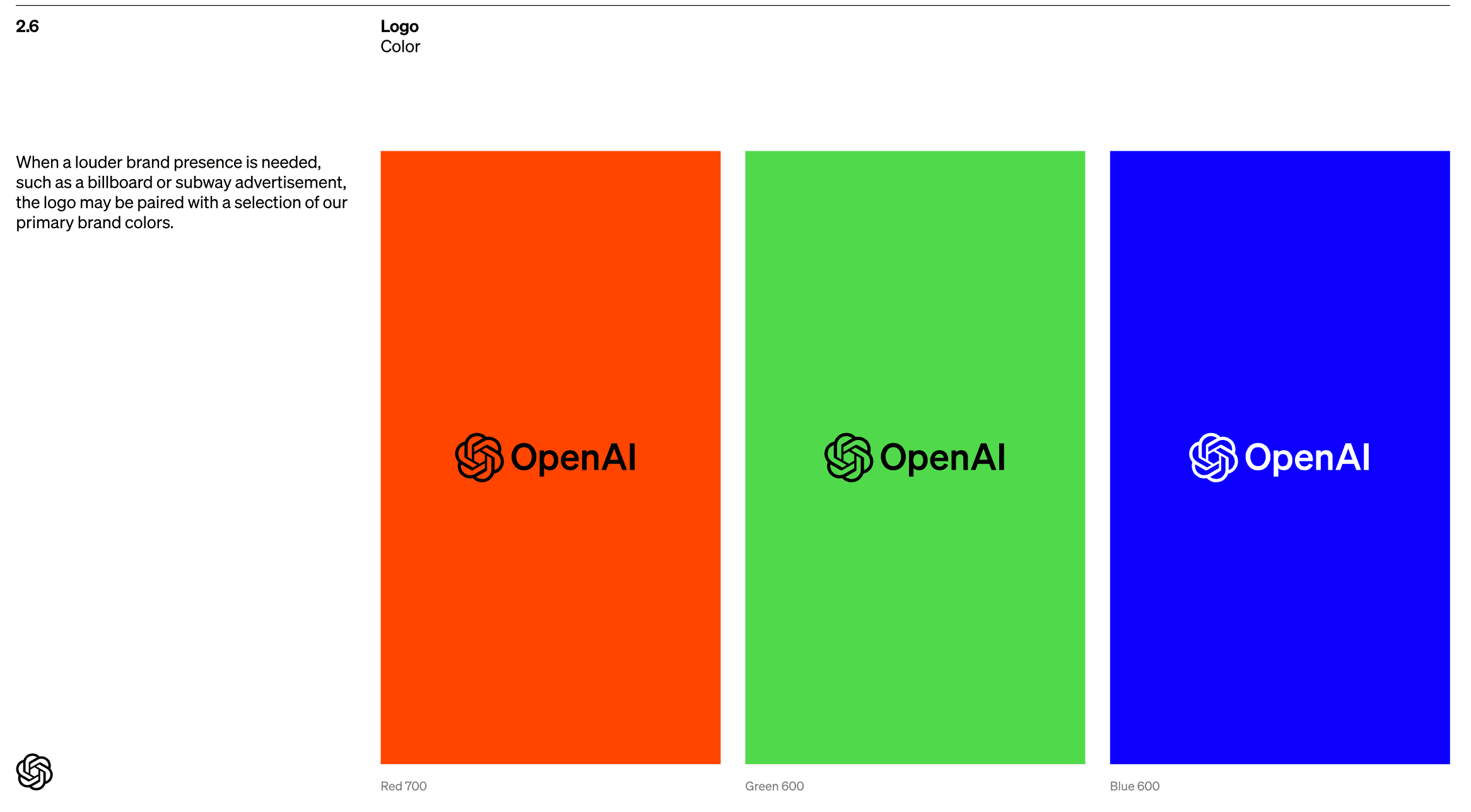
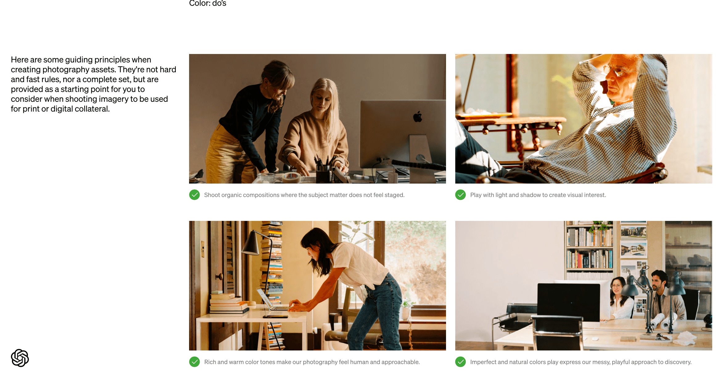
OpenAI's brand guidelines cover a comprehensive range of topics to ensure brand consistency and proper usage. The document starts by outlining the language standards, focusing on appropriate models and plugins, and specifying rules for non-partnerships and content attribution. It then delves into assets, providing detailed instructions on logos, including spacing and sizing guidance, as well as common pitfalls to avoid when using the logo. The guidelines also include sections on how to structure press releases and usage terms. For additional queries, contact information is provided at the end of the guide.
Check out the full brand guideline by clicking here.

Apple
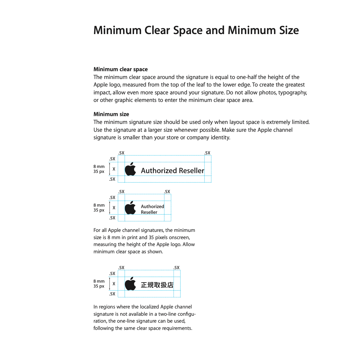
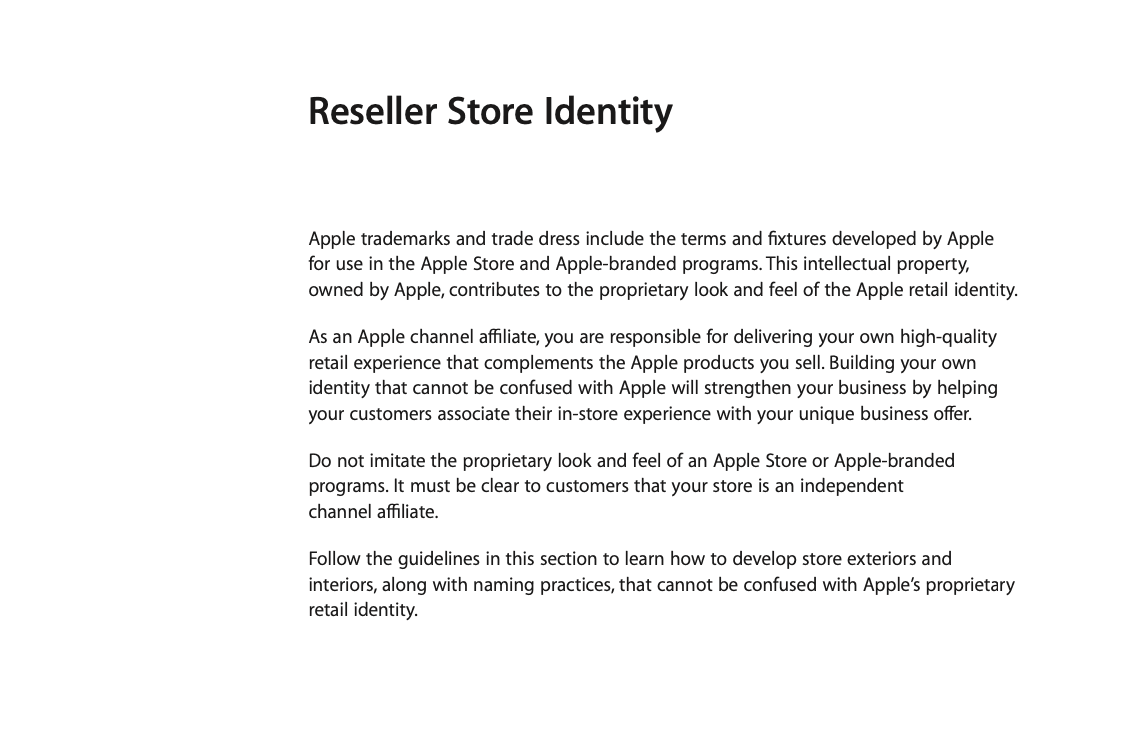
Apple's brand guidelines provide a comprehensive roadmap for channel affiliates and Apple-certified individuals to maintain brand consistency. The guide covers everything from channel signatures and typography to store identity and exterior design requirements. It also addresses the proper use of Apple assets and product photos, as well as the specific naming and identity practices for reseller stores. Editorial guidelines specify how to use Apple authorizations and product names in text. Finally, it concludes with trademark and credit line protocols, ensuring all external communications align with Apple's brand identity.
Check out the full brand guideline by clicking here.
Uber
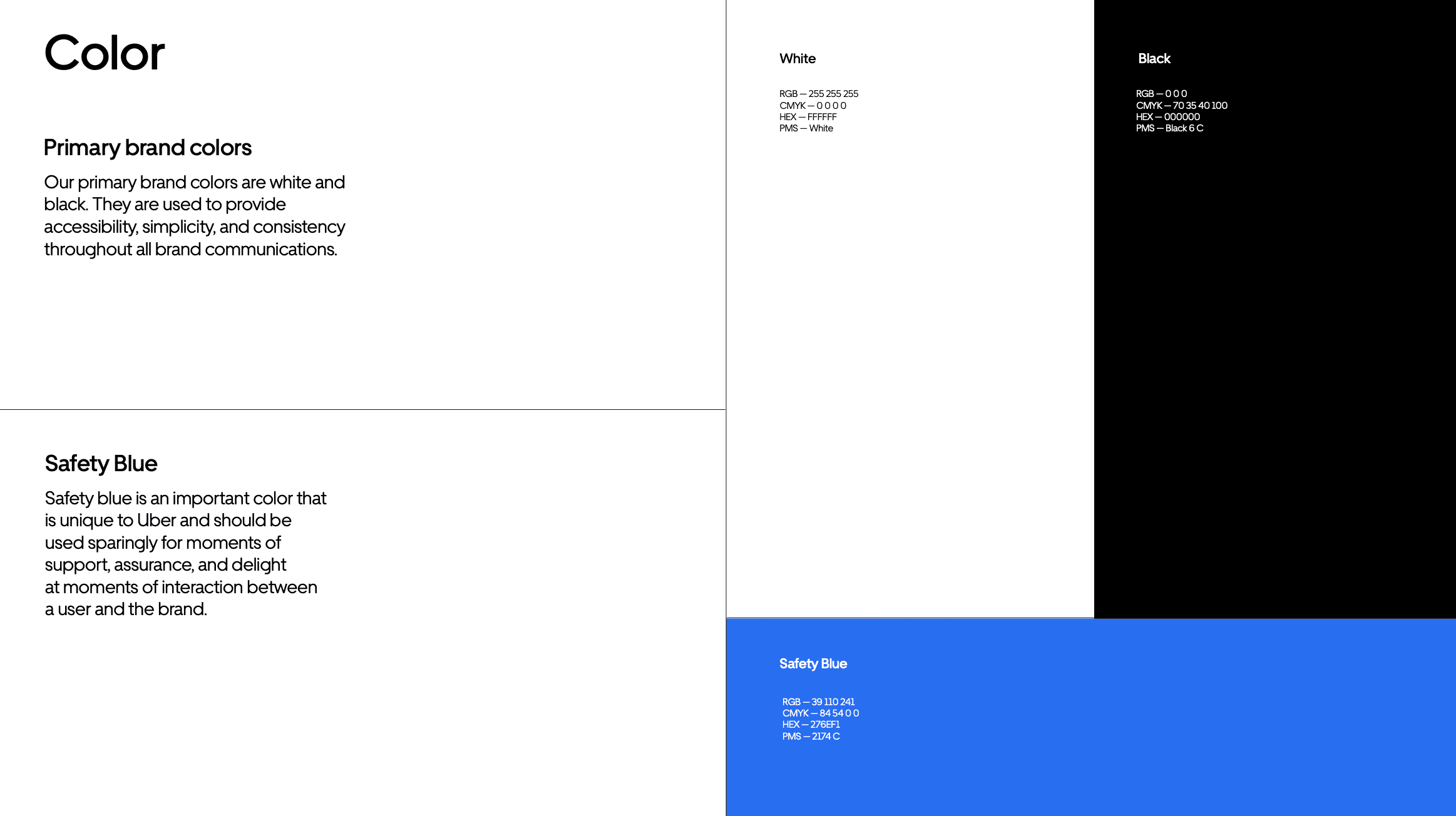
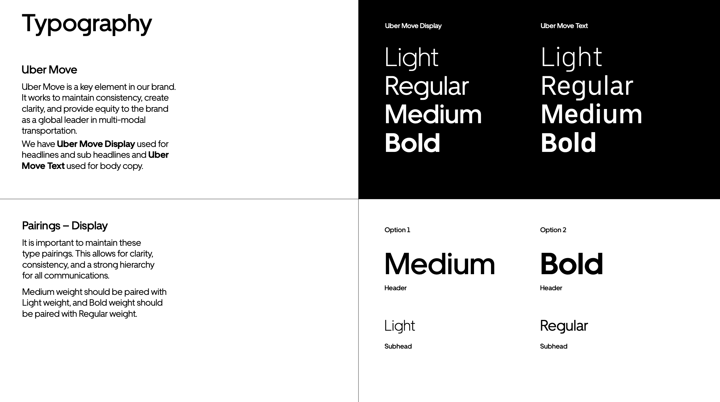
Uber's brand guidelines are designed to assist partners and sponsors in maintaining brand integrity across various platforms and communications. The guide outlines the correct use of Uber's logo, including specifications for clear space and lock-ups for partnerships and products. It also describes Uber's primary and secondary brand colors, as well as the specific shade of blue designated for safety concerns. The guidelines offer direction on typography, featuring Uber Move, and provide examples for text hierarchy and calls to action. Overall, the document aims to standardize the brand's visual representation and messaging.
Check out the full brand guideline by clicking here.
Walmart
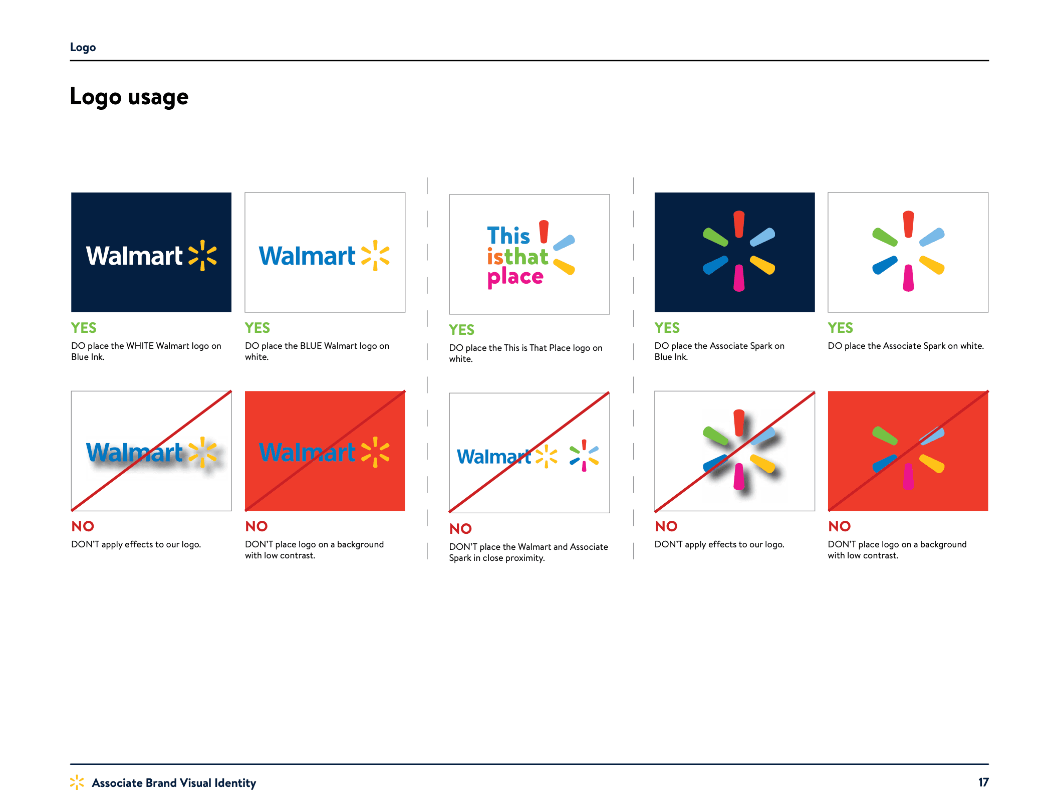
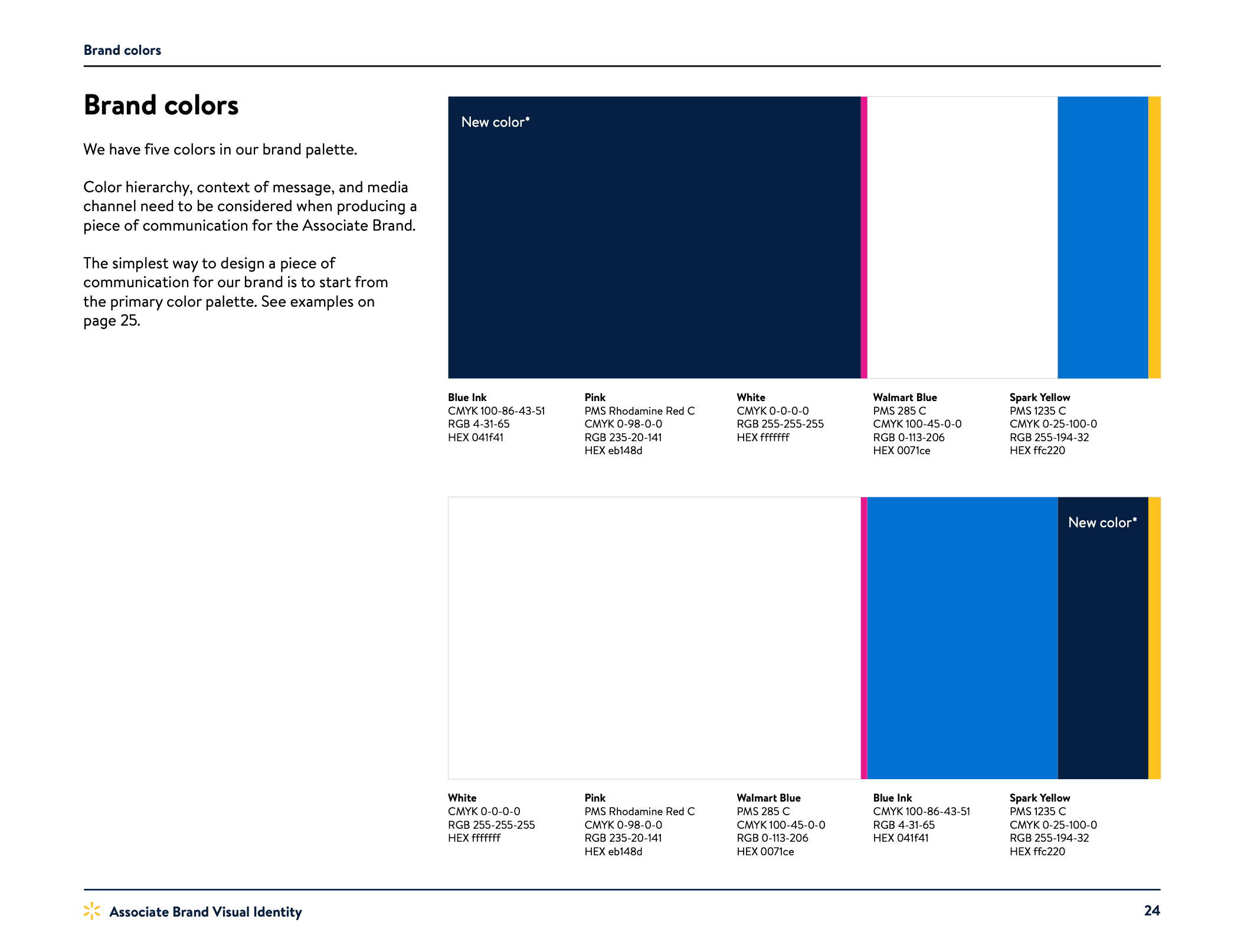
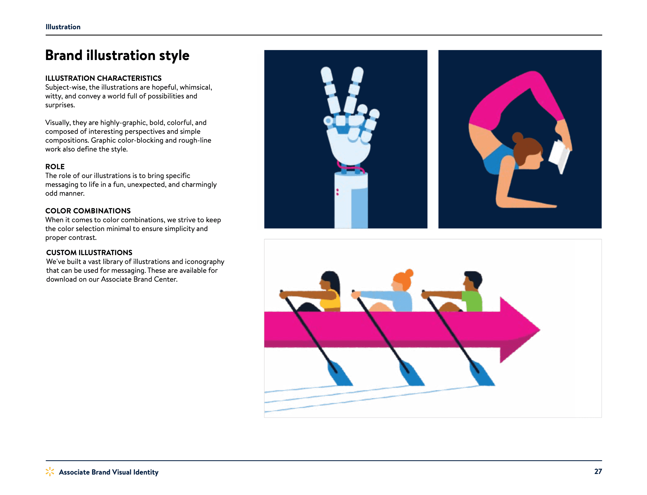
Walmart's brand guidelines kicks off with 'Voice & Tone,' providing general guidelines along with do's and don'ts for effective communication. The 'Design' section delves into creative principles, logo usage, typography, and brand architecture. It also outlines the brand's color palette and guidelines on its application in layouts. The guidelines feature an 'Illustration' and 'Photography' section detailing the style, role, and layout usage of visual assets. Video guidelines including bumper examples, as well as UX/UI design overview, are also included, ensuring a cohesive brand experience across all customer touchpoints.
Check out the full brand guideline by clicking here.
Hulu
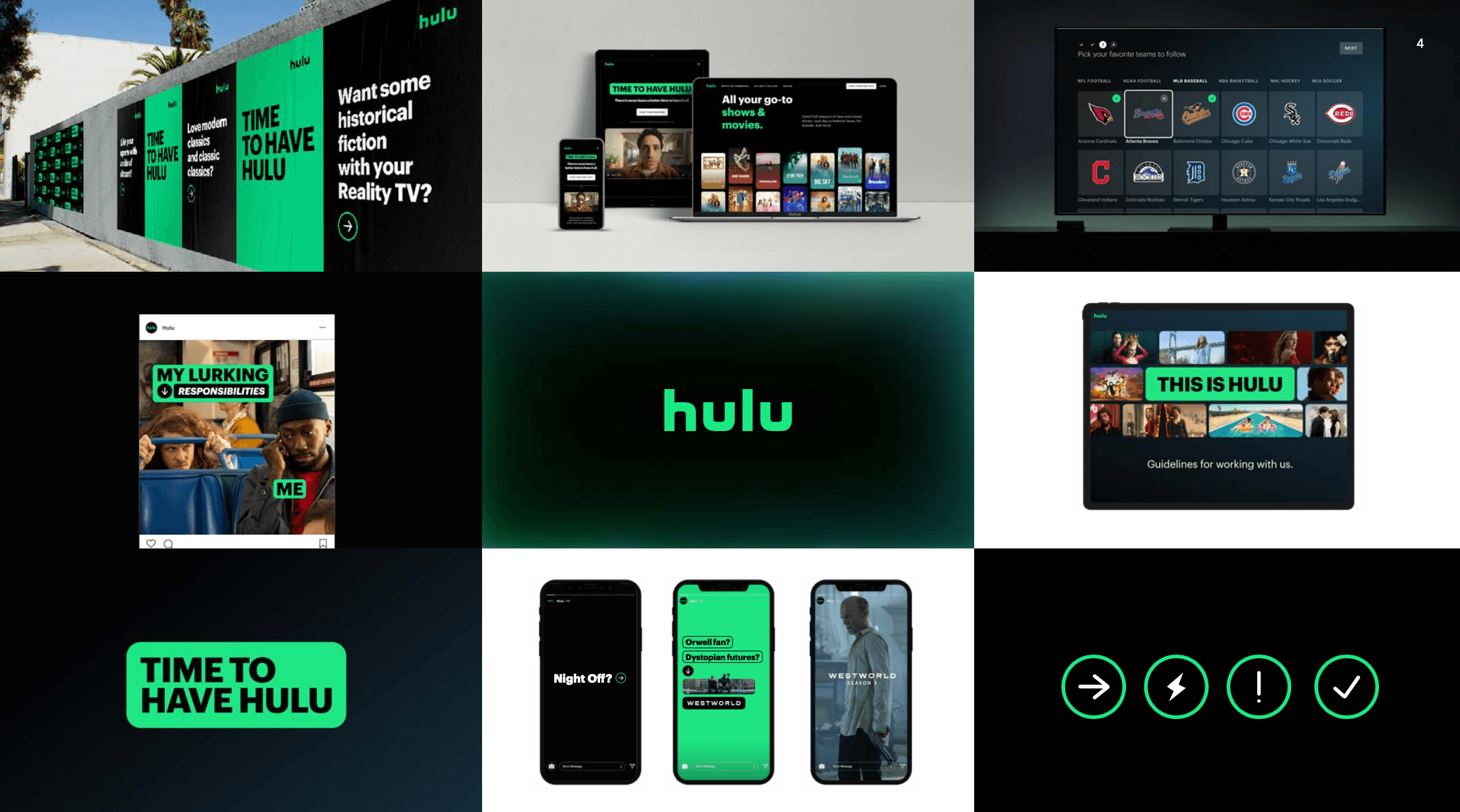
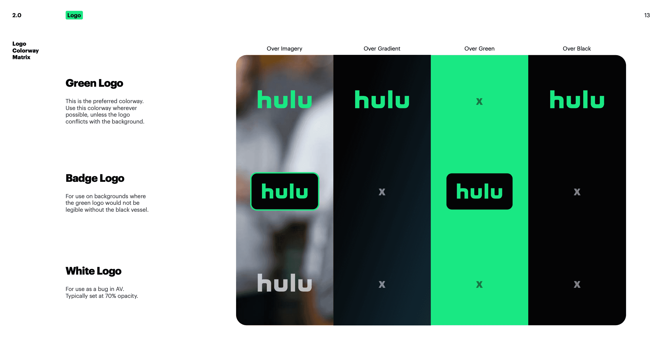
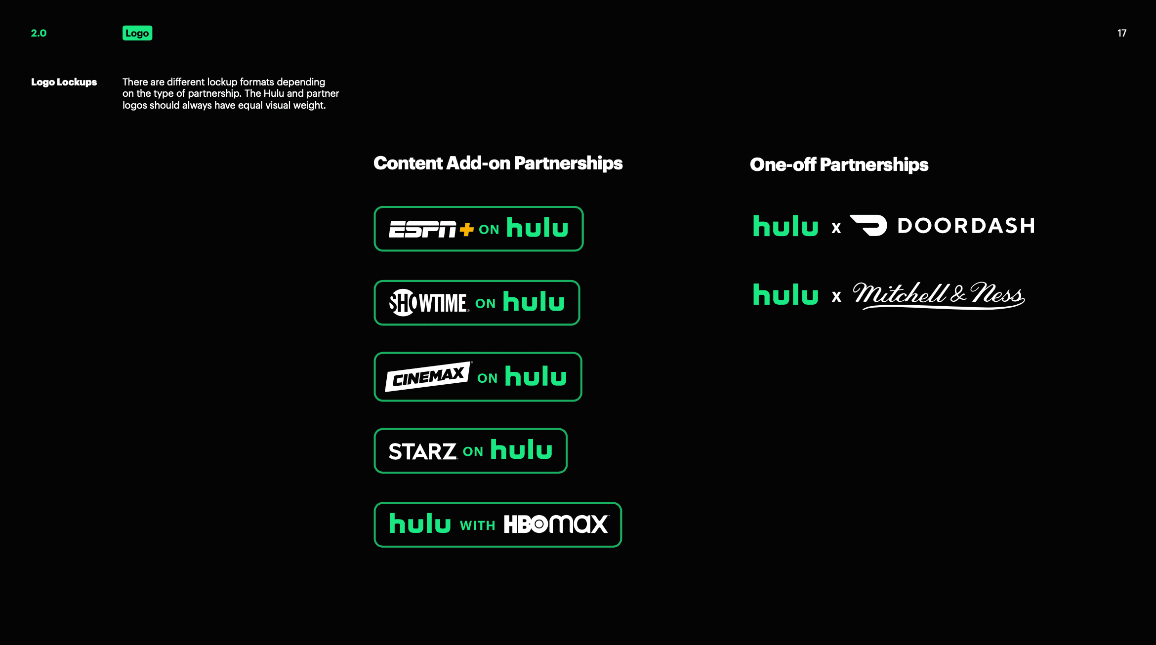
Hulu's brand guidelines document starts with Global Design Principles and goes on to detail logo specifications, including attributes, safe zones, and a color-way matrix. It elaborates on Hulu's color palette, particularly focusing on "Hulu Green" and other primary colors. The guidelines provide extensive advice on typography, typefaces, and what to avoid. Iconography and illustration rules specify styles, types, and even nuances like stroke weight. Finally, the guide also covers layout styles and call-to-action buttons, as well as motion theory principles for video content, ensuring a consistent look and feel across all platforms.
Check out the full brand guideline by clicking here.
Zoom
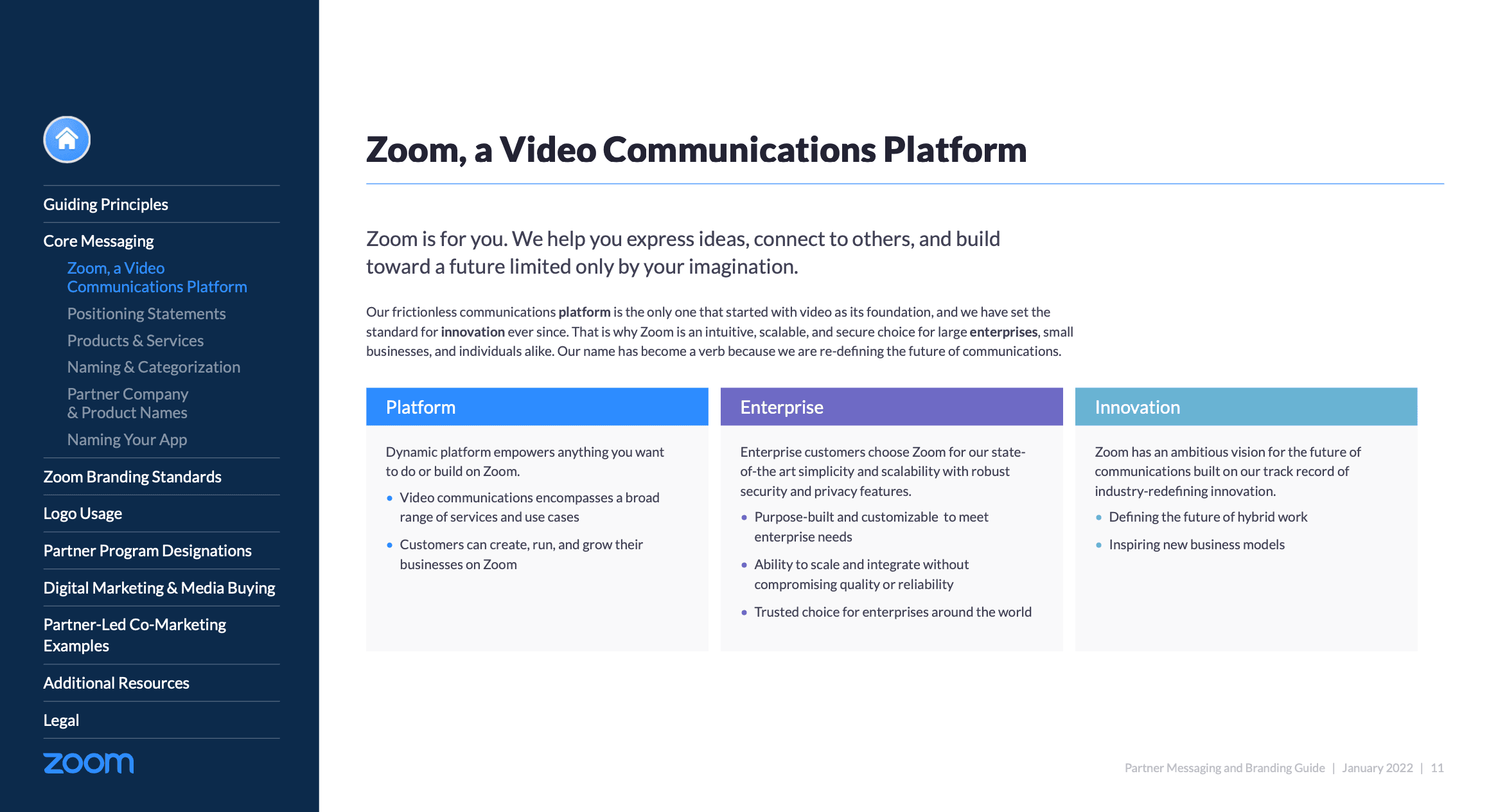
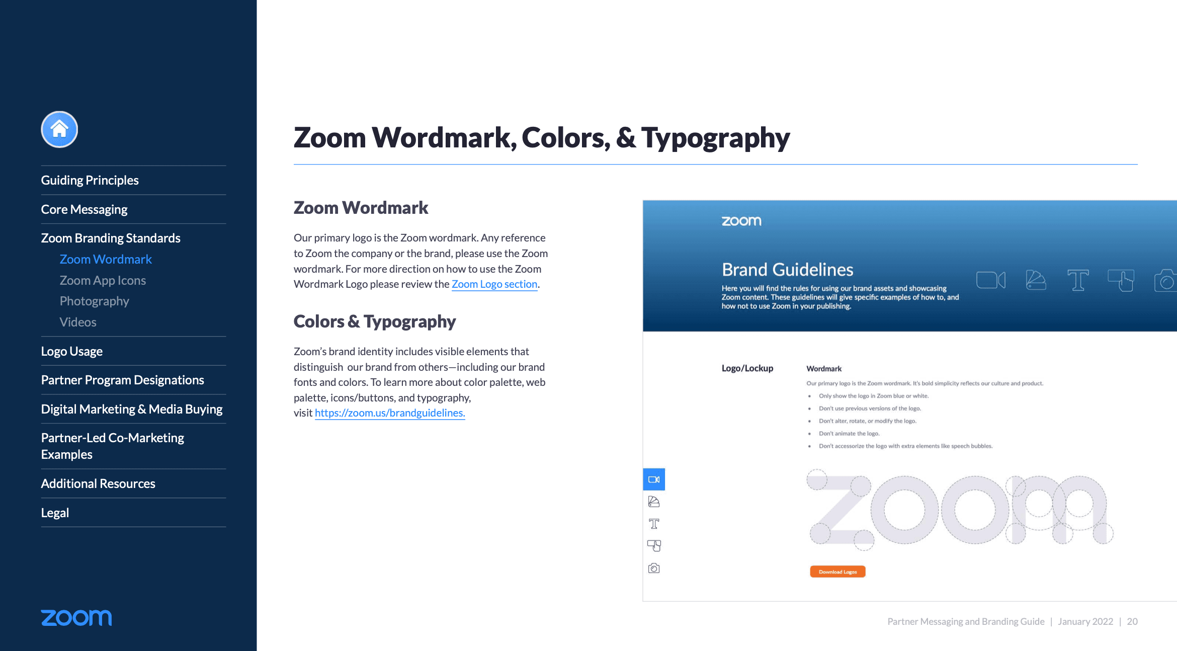
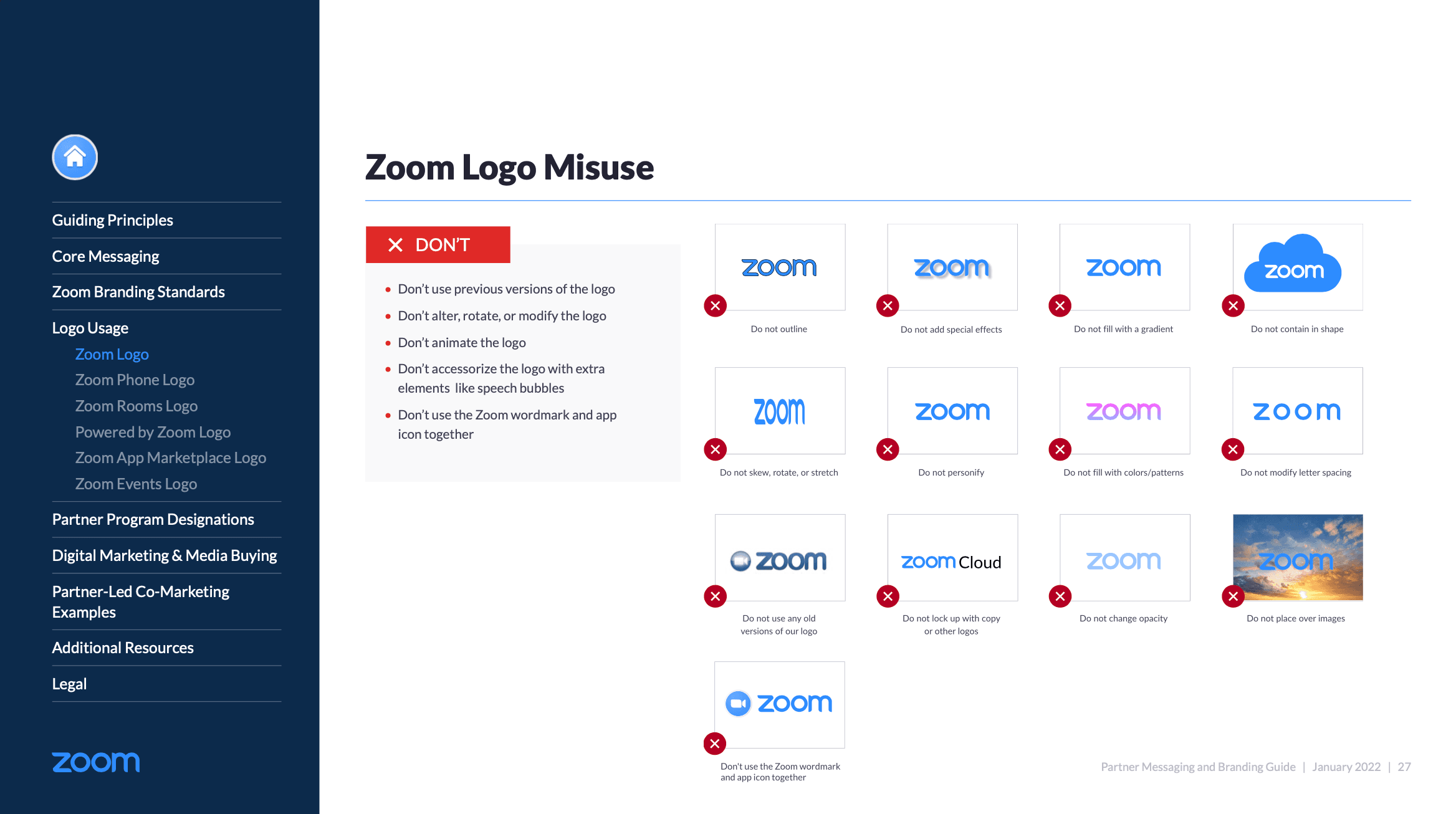
Zoom's brand guidelines starts with Guiding Principles and Core Messaging to establish the brand's voice and mission. It sets clear standards for logo usage and provides guidelines for digital marketing and media buying activities. The guide also offers examples of partner-led co-marketing campaigns to inspire effective collaborations. Additional resources and legal considerations round out the guide, making it a complete resource for any Zoom branding effort.
Check out the full brand guideline by clicking here.
Twitch
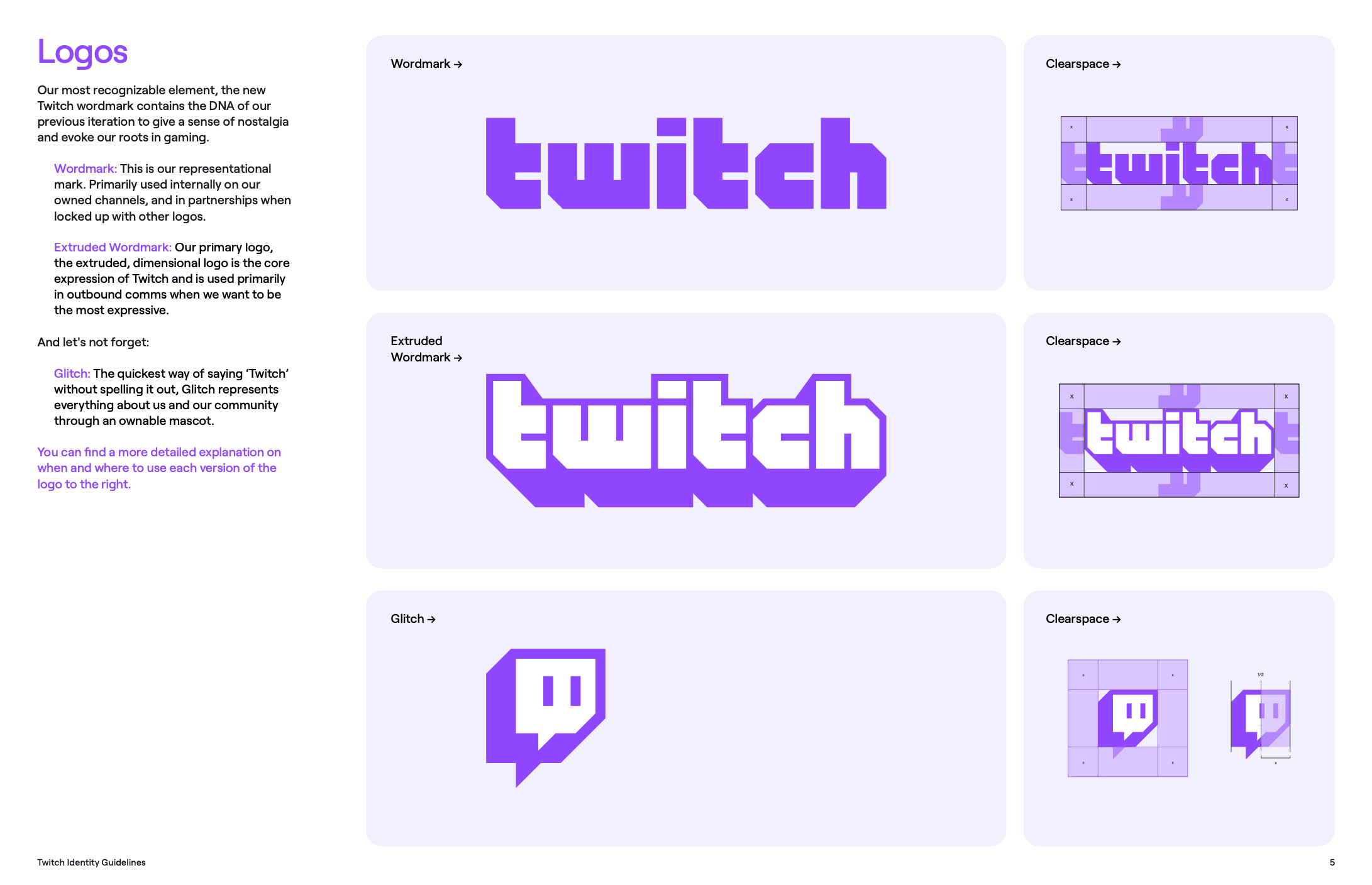
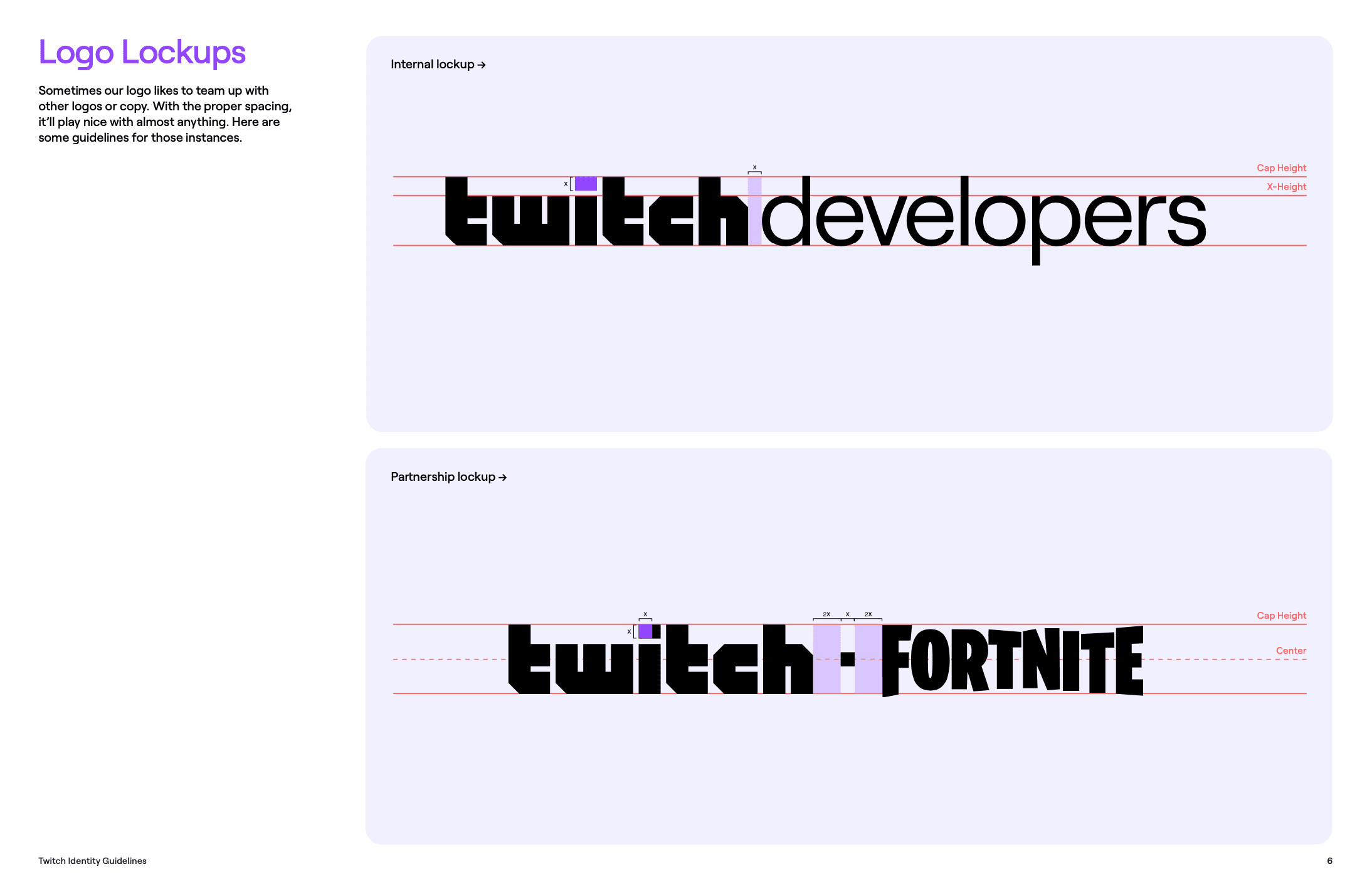
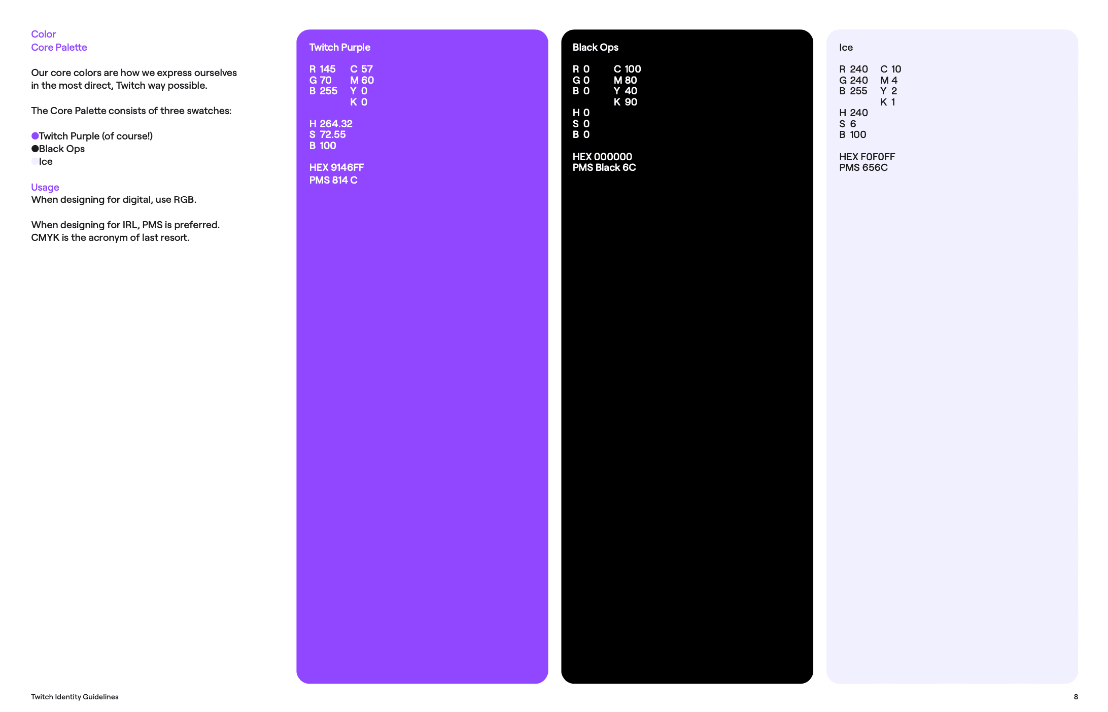
Twitch's brand guidelines focus on four main elements: logo, color, typography, and voice to maintain brand consistency. The guide details the use of different logo forms, including the Wordmark for internal channels and partnerships, as well as the Extruded Wordmark for outbound communications. It also introduces "Glitch," an ownable mascot that serves as a quick visual representation of the Twitch community. The guide emphasizes a brand voice that reflects the platform's energetic, game-loving community, aiming to present Twitch as a "kindred spirit." Specific guidelines for logo clear space and usage scenarios are also provided for better understanding.
Check out the full brand guideline by clicking here.
Build Your Own Brand Guidelines with AI
If you're about to start your own business and you get that having a brand guide is a big deal, then you're off to a good start. But let's face it—getting the look and feel of your brand just right can be a real headache, especially if you're not a design guru or if hiring a professional design team isn't in the budget right now. But hey, welcome to the 21st century where you don't have to do it all alone! Enter uBrand, your AI-assisted branding platform that helps entrepreneurs create and launch new brands.
With uBrand's Guideline Generation, you can easily establish the visual elements that define your brand—from your logo to your color scheme, and even the core of your messaging. What's more, this AI-assisted platform will generate a tailor-made brand guideline for you. It's like having a branding agency in your pocket, but without the hefty price tag. This is an invaluable asset in today's digital age, helping you ensure that no matter where your business shows up, it shows up as 'you'. So go ahead, let uBrand help you build a brand that not only looks good but feels right.

