
Minimalist Logo Design Tips: Just Add Colors!
-1705093634.png&w=3840&q=75)
Minimalist logo designs are recognized for their simplicity and recognizability. Unlike more complex designs, minimalist logos remove unnecessary elements, leaving only a clear and simple expression. So how do you make a minimalist logo? Today we're going to show you one of the easiest logo color tricks you can do to design a minimal logo.
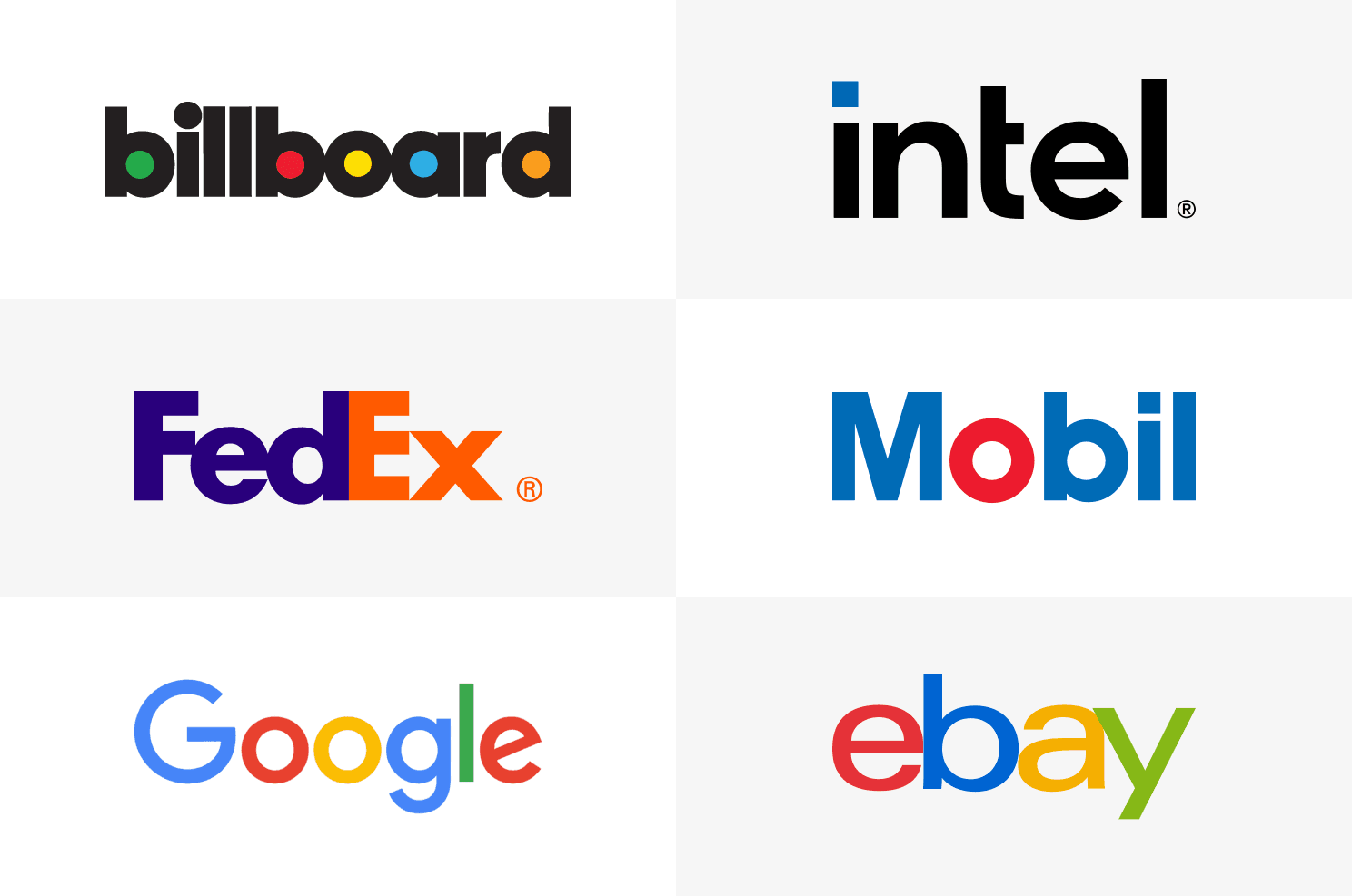
Let's take a look above famous minimalist logo design examples. Do you recognize something in common? For example the famous billboard's logo is just colors added to the closed letter areas. The Mobile's logo is constructed with a color highlight on letter "o". And Google's logo is adding a different color to each letter and so on. Now, let me show you how to create similar minimalist logos using our AI Logo Maker.
Create a minimalist logo by just adding colors
Take a look the following example. You can start with any logo templates and create your own minimalis logo in 3 simple steps.
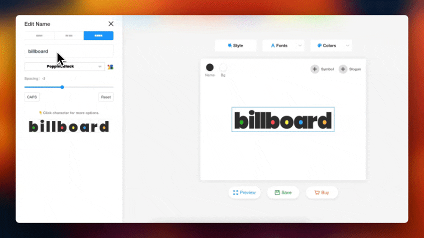
Step1: Click on "logo name" and select the "Letter Split" layout option
Step2: Change logo text to your own brand name
Step3: Click on any letter to add colors
3 color tricks for your minimalist logo
Famous logos have a huge impact on customers' impressions, but sometimes their logos are very simple. We will introduce 3 tricks to make distinctive logo. Now, let's take a look at the color logo design.
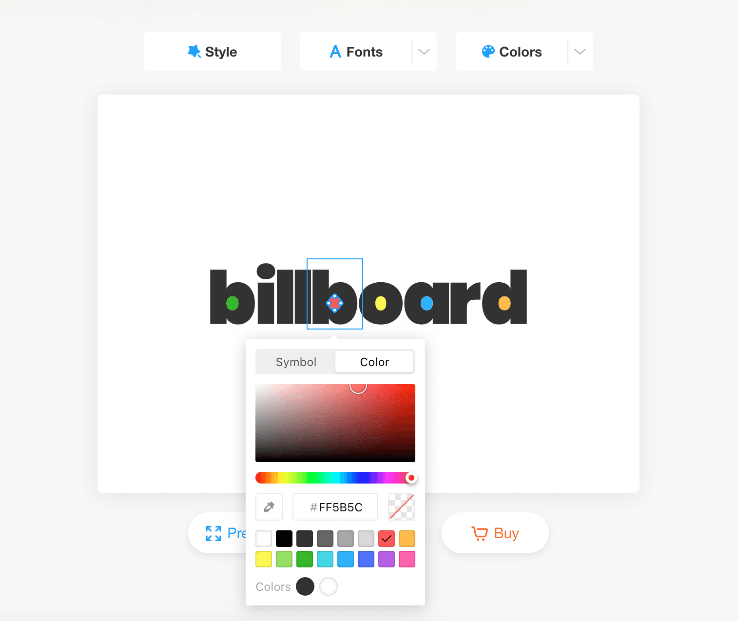
#1: Add colors to parts of the letters
When the text is the main attraction of the logo, adding color is a great way to differentiate the brand visually. This is the first trick used by the well-known logo, Billboard. You just need to add color to closed areas of the letters, and the logo instantly stands out.
👇For your convenience, you can click on the image below to edit the logo directly. Change the name of the logo and create your own.
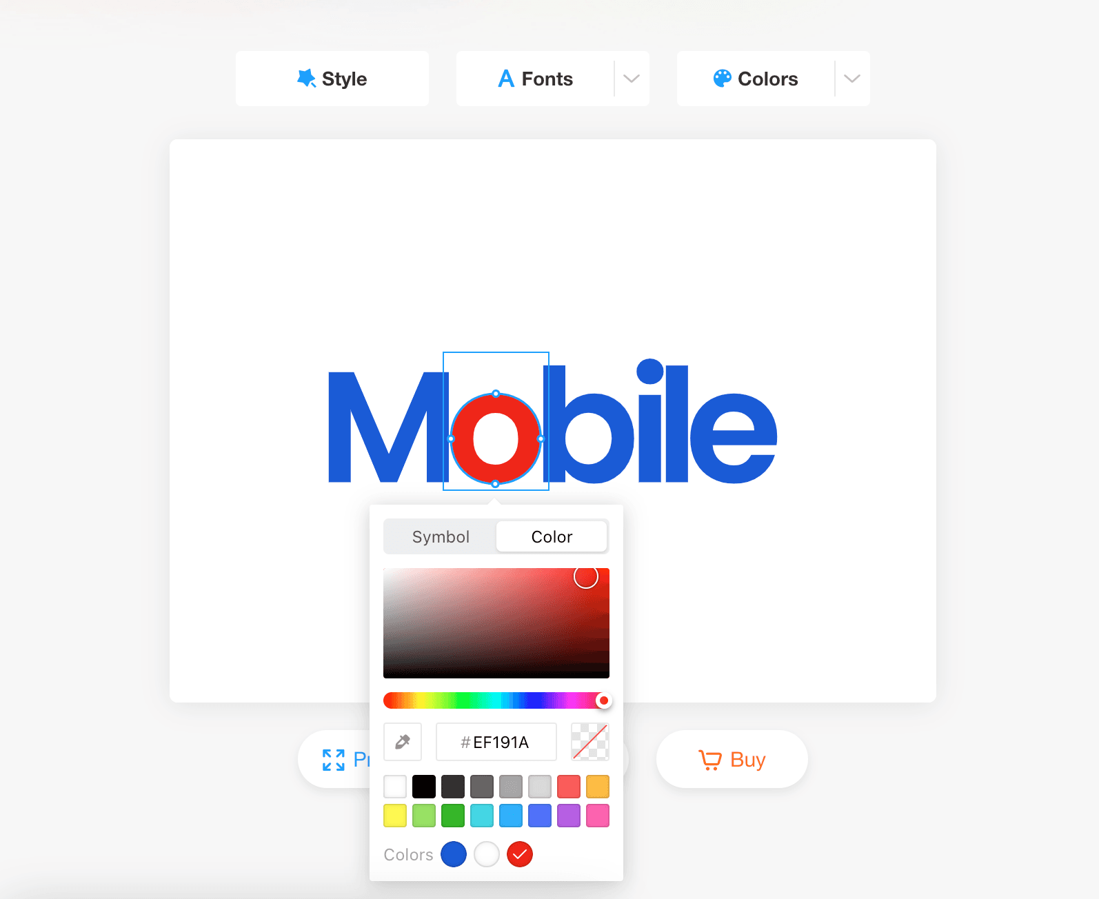
#2: Highlight a letters with color
Another way to add interest to a logo is by highlighting a letter or some letters. This creates contrast and makes people recognize the vibrancy. It can also form new words or meanings, providing more information through the logo. Let's take "Mobel" as an example.
#3: Colorful letter combinations
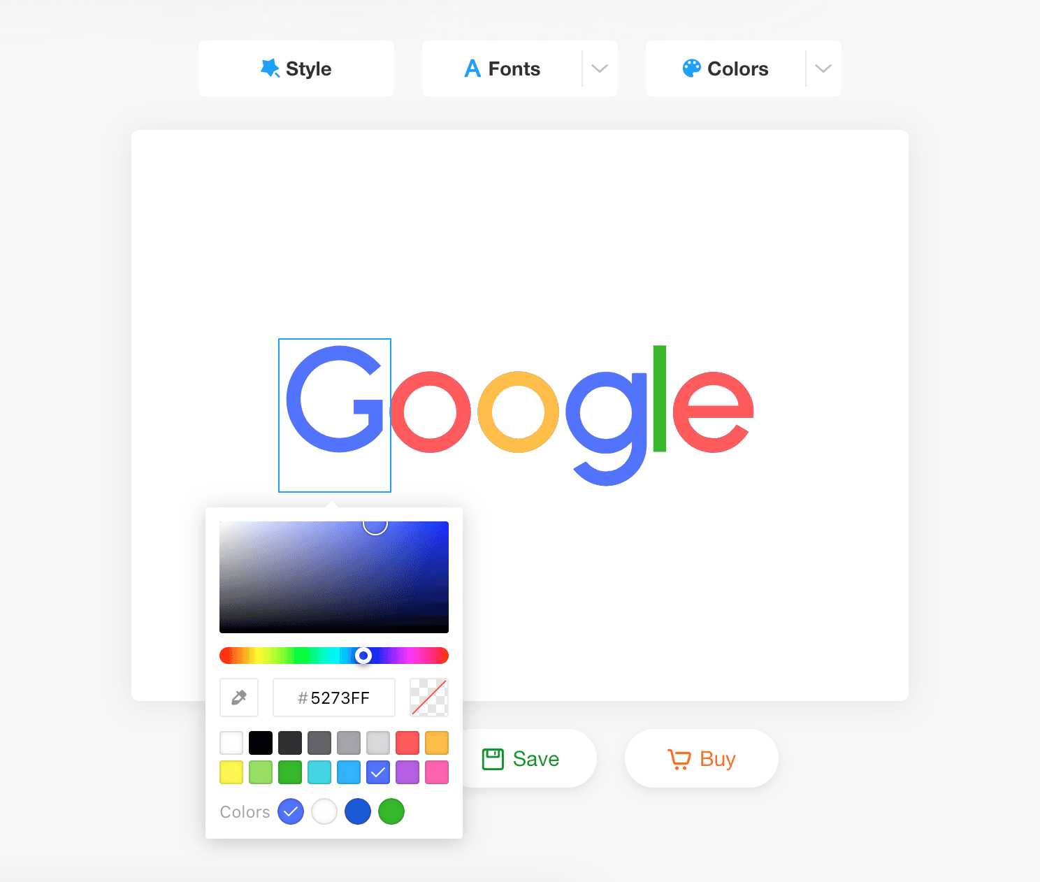
The third trick is using colorful letters, which is highly practical. Famous companies such as Google have adopted this technique for their logo. Each letter is assigned a different color: the first "G" is blue, the "o" is red, the next "o" is yellow, the "g" is blue, the "l" is green, and the "e" is red. The overall design is easily recognizable.
Create your own minimal logo 👇
I'm sure you're familiar with all three tricks by now, so let's take a look at some more logo templates! Click on it to go to edit the logo name, save it as your own logo, I hope it can give you more inspiration. Come on and try it.
#1:Banana
The brand Banana uses three colors to fill in the closed areas of the letter "a", making the logo bright and unique.
.png&w=3840&q=75)
#2:Moody
Moody also fills the areas in the letters "o" and "d". These colors reflect different moods to match the concept of "moody". It is an interesting logo design.
.png&w=3840&q=75)
#3:PayMo
Paymo is a payment tool. Its logo uses the letters "m" and "o" in green and the rest of the letters in black. This creates a strong contrast, making it easy for people to notice the word "pay", which is the main focus of this brand's business.
.png&w=3840&q=75)
#4:Plantr
Plantr is a market offering designs for yard plants. Its logo uses the letter "t" in orange, giving the logo a modern look.
.png&w=3840&q=75)
#5:Rainbows
Rainbows is an English learning community. Its logo incorporates rainbow colors, giving it an overall abstract and rich look.
.png&w=3840&q=75)
#6:Cobiro
Cobiro is a tech product, and its logo utilizes vibrant colors reminiscent of a coding screen to establish a distinctive image.
.png&w=3840&q=75)
Conclusion
Finally, let us review the above. By adding color to the closed area of the letter or to the letter. It can quickly allow us to create logos that stand out. We can also edit the logo directly by clicking on the templates above to create whatever you want. uBrand will continue to share more tips in the future. If you have other ideas, feel free to share them with us. Follow uBrand for more logo design and brand identity tips!